Here’s an interesting way of looking at this. I took some data:
Sliced it and diced it and turned it into this:

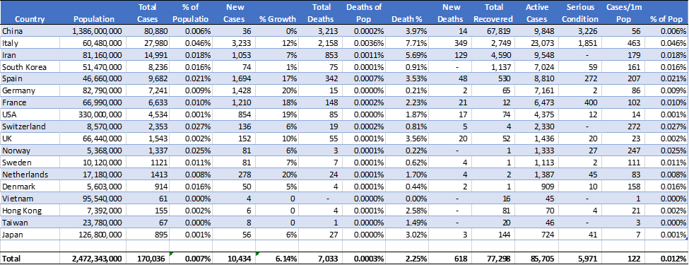
(not all countries are on here; these are the 15 largest outbreaks, which make up about 95% of reported cases globally)
Spend some time on that. It’s fascinating. Here’s the cheat sheet:
- The size of each country’s bubble represents the size of their outbreak. For example, China is the largest at ~81,000 confirmed cases, Italy 2nd at ~28,000 cases, Iran 3rd at ~15,000 cases, etc. Obviously smaller is better. We see the US is a small bubble, but we’re just getting started – China had a 90-day head-start on us.
- The Y-Axis represents how far the infection has spread within their country by measuring the percentage of population infected, at least by confirmed counts. Italy leads the pack (not in a good way) at 0.036% of her 60mm citizens infected with confirmed cases (unconfirmed much higher). Switzerland 2nd at 0.027% of her 8.5mm citizens, Norway 3rd at 0.025% of her 5.4mm citizens and so on. We here in the US are near the bottom at only 0.001% of our 330mm citizens, but again, we’re just getting started.
- The X-Axis shows the mortality rate of those infected (note: not of the entire population, just as a percentage of confirmed cases). Poor Italy again leads the pack with 7.71% of her 28,000 cases resulting in death, Iran next at 5.69% of her 15,000 cases, and China 3rd at 3.97% of her 81,000 cases. The US is currently running at about 1.87% of our 4,534 cases, but again, we’re just getting started and these numbers will only increase.
- Note: the Y-Axis numbers will only go up from here; infections as the numerator in the equation will only increase, whereas the population as the denominator will stay static. The X-Axis, however, will likely stay roughly the same, even converging toward a common number across all the countries as testing is standardized and we get more data.
(There are several limitations on this data[1], but it’s all we have for now, so let’s roll with it knowing it’s far from perfect.)
Some interesting data observations nonetheless:
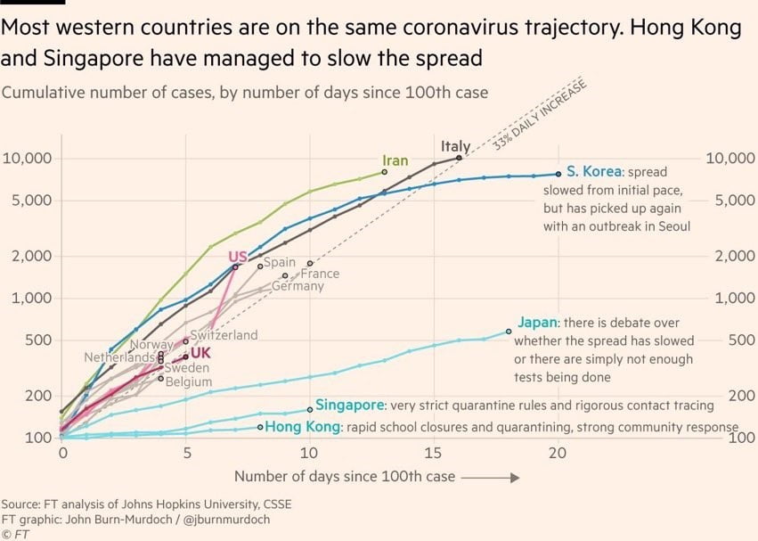
Asia is closest to containing the spread. China, South Korea, and Japan are all down to single-digit infection growth rates by percentage. There have been several days over the last week where China supposedly had no new cases. Remember their large, temporary hospitals erected in record time?
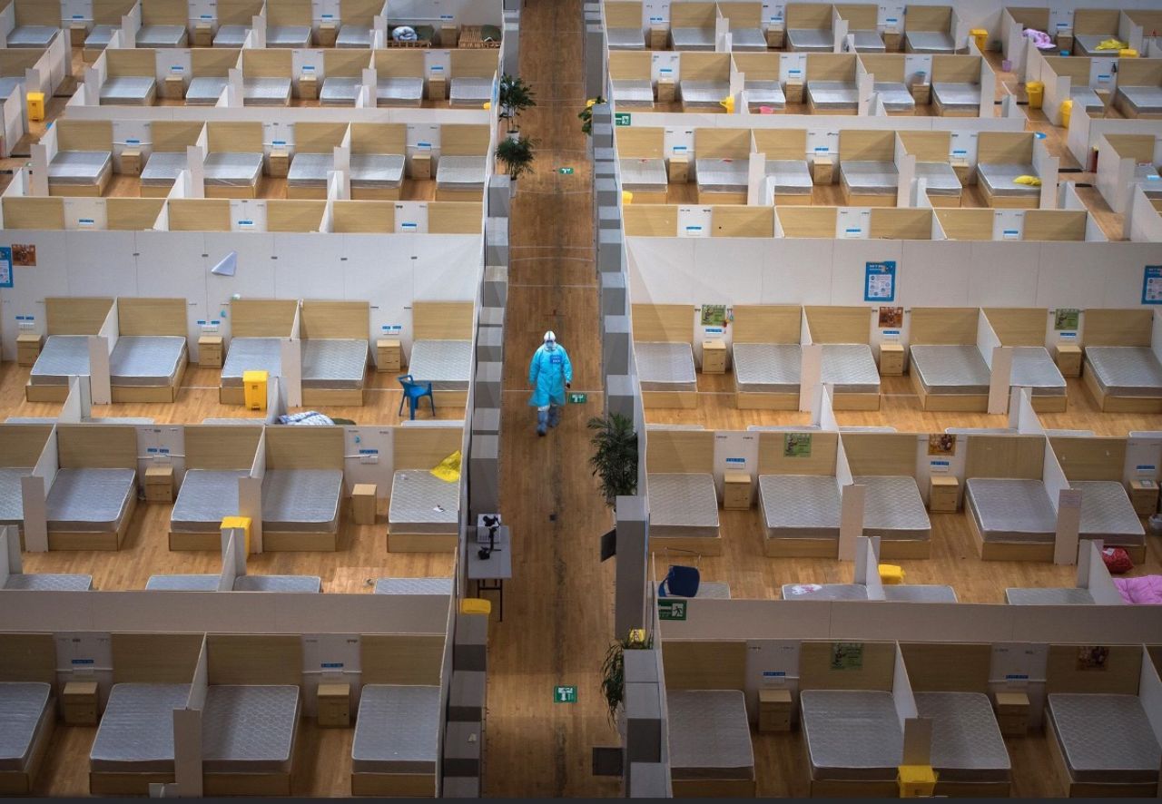
Supposedly the last 2 of those 16 hospitals were closed down last week. Their data is always suspect, but I hope in this instance, it’s correct.
Unfortunately, Europe is now the epicenter of the storm, with the Americas right behind. Germany, France, Spain and several other European countries are growing at 18-20% per day. The US is just under 20% per day.
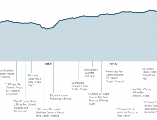
These numbers can be scary, and the media is having a heyday with them. You’ve seen the fear, paranoia, and panic that’s set in now. When was the last time you saw the NBA, NHL, and MLB shutdown, colleges and schools send everyone home, travel restricted, and the Dow drop 9,000 points in 4 weeks? Yeah, I don’t recall that either.
But let’s look at the ultimate scary data in the chart above: MORTALITY. We’ve never seen this strain in humans before, hence why it’s a novel virus. There are no vaccines yet, and no drugs to take once infected. We’re all scared of the unknown. The media has us all convinced we’re all going to die. Let’s drill into that data a bit.
Let’s look at the Asian countries, as they’re the most experienced with this virus, have the most data, and appear to be closest to containment:
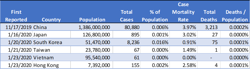
So, using the data above, a person in China has a 0.006% chance of becoming infected, or 1-in-17,000 (infected, not dead; just sick). Your probability of becoming sick, and then eventually succumbing to the virus, are 0.0002%, or 1-in-431,000. Turning to Japan, you’re at 0.001% for getting sick, or 1-in-141,000; for dying, you’re 0.00002%, or 1-in-4,600,000.
Go back to that bubble chart above and let’s look at the worst-case metrics (so far, anyway). Our Italian friends have the highest probability of getting infected at 0.046%. Read that number again aloud – 0.046%. Not 46%, or 4.6%, or even 0.46%. That’s 0.046%, or 46/1000th of 1 percent probability of getting infected. And unfortunately, once infected, the Italians have an alarmingly high mortality rate at 7.71%. But that’s 7.71% of 0.046%, or 0.0036%. So, even in Italy, the worst of the worst, you have a 0.0036% chance of dying from #Coronavirus. Read that aloud again – 0.0036%, or 36/10,000th of 1%.
And that’s using just Italy as a so-far-worst-case scenario; if we incorporate China and Iran (the three largest outbreaks), your probability of mortality drops to 0.0004%, or 1-in-245,000.
Now, as I mentioned repeatedly already, case counts and deaths will only keep climbing, which means these probabilities will only get larger. If we were to hypothetically triple Italy’s case count from here (to almost 90,000 cases) and corresponding mortality rate, you’d still be at 1-in-10,000 odds of dying.
I’m not trying to be Pollyanna here as we are talking about someone’s mother, father, sister, brother, daughter, or son dying. But I am trying to be an realist, using the objective data we have now.
Feel free to take some of the data above and extrapolate your own projections as to what it looks like here in the US. I did out of curiosity, but won’t post them here as I’m still no epidemiologist, immunologist, or virologist and it would be misinformation to represent my extrapolation as any type of qualified projection. But take your calculations and compare them to:
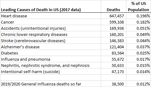
| https://www.cdc.gov/nchs/fastats/leading-causes-of-death.htm |
The projections were actually somewhat comforting. Not pleasant, but not nearly as grave as the media is representing.
So if you’re saying it’s not going to be as bad as my Facebook/Twitter/Linked-In feed say it’s going to be, then why are we going into lockdown?
Let’s look at the bubble chart again:
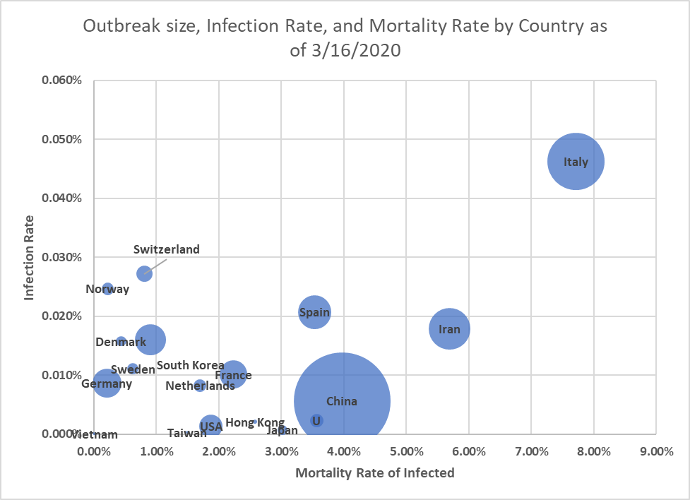
There’s a substantial difference between what Italy’s outcome has been compared to what’s happened in Taiwan, Hong Kong, Japan, and even China itself.
Because this infection spreads so quickly, has no vaccine, and no drug to take once diagnosed, about the only way to slow it down it down is to limit it’s spread by physical and geographic means. Those that were quickest to isolate/quarantine have had the best outcomes so far:
This puts all government officials and local leaders – from national presidents and prime ministers, to state governors and city mayors, to local school district boards and community organizers – in between a rock and a hard-place:
- Option A: Do we let everyone go about their normal routine, but helplessly watch infections skyrocket and quickly overwhelm our nation’s medical resources, causing a bunch of excess deaths? Or,
- Option B: Do we isolate/quarantine/lock-everyone-down to control the spread, but create all kinds of lost productivity and economic damage, let alone all panic, paranoia, and fear?
In other words, which is more important: human life, or short-term economics?
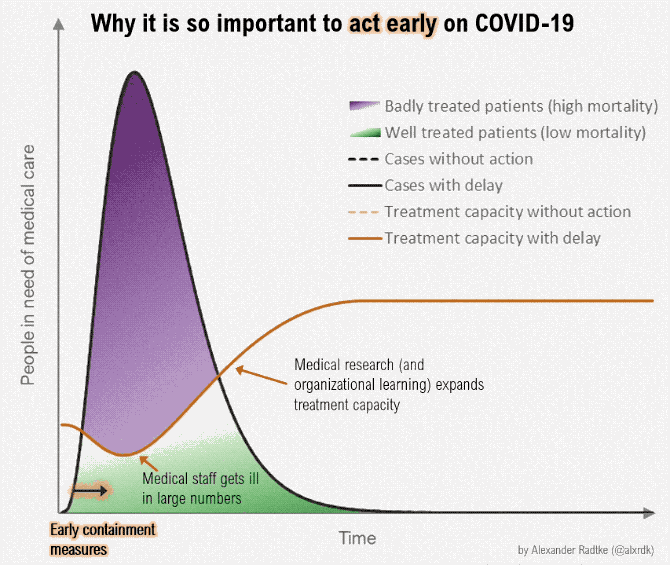
Hence, trying to ‘flatten the curve’.
If there’s one lesson that can be learned already in this disease’s short timespan is that controlling the physical spread of the disease – through ‘social-distancing’[2], postponed events, and limited travel – has been the best defense to stopping it:
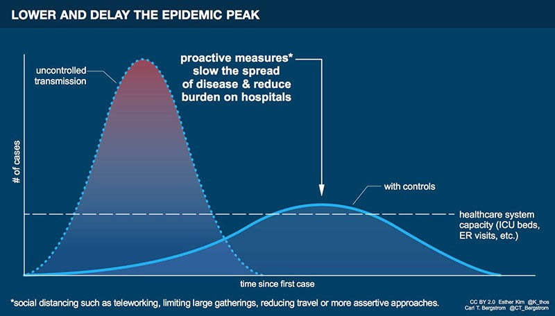
(the tall curve above is Option-A from above; the flatter curve is Option-B)
In short, all of these isolations, quarantines, and social-distancing measures are because we’re ‘trying not to pull an Italy’ here. We’re trying to slow the spread (slow the Y-Axis on the bubble chart above) and flatten the growth curve:
The Washington Post has an outstanding explanation and animation on ‘flattening the curve’ showing a couple different outcome scenarios. If you click on only one link in this note, follow that one. If you understand that, you’ll understand what our nation’s leaders and health officials are trying to accomplish. As much as I don’t like what it will do to the economy in the short-run (look at what the Dow thought of it today), it’s probably what’s best for our country in the long-run.
The more the US can respond like Japan and South Korea and less like Italy and Iran, the better we are. When this is all said and done, the countries that stay low and left on the bubble chart – and not high and right – will be the big winners. Hence temporary isolation, restricted travel, and frequent handwashing (and let’s keep that part up when this is over, please).
So, do your part to help us all be more like Japan and less like Italy. Temporarily isolate. Restrict travel. Wash your hands. Stop panic buying. Chill the #%*@ out. Go for a walk with your spouse or kids or dog or whomever. Realize how good we have it here in the most advanced country in the modern age. It’s moments like this that make us realize just how good we’ve had it. And how much we want that back.
But it’s not the virus that will derail our otherwise super-strong economy; it will be all the secondary fear, paranoia, hoarding, and pessimism that we seem to love to feed on.
The Federal Reserve has made it abundantly clear they will step in with monetary policy as needed. And Congress is right behind them with fiscal policy as appropriate.
Yes, hotels and airlines and cruise ships and the like will suffer. But don’t worry about the bigs. They have the smartest CFOs and the biggest bankers and will find a way through this. Worry about that family-run restaurant down on the corner. Find a way to support the little guys. Keep your personal economy going as best you can. I’m confident our nation’s economy will be fine in the long-run (look at 9/11 or 2008). It’s everyone’s short-term personal economy I’m concerned about.
We here at Sanctuary have kicked it into overdrive and are going 110% as we are able to operate remotely as needed. May sound goofy, but we’ve actually trained for an event like this once per year for the last several years. We always assumed it would be a building fire or flood that would dislocate us; little did we know it would originate from a wildlife market in Wuhan, China. Crazy to think such a simple event could bring the world’s routine to its knees, at least temporarily.