Over the last 12 months, US stocks are up 8.09% (even after the recent decline). Yet, when I look at my portfolio, I’m nowhere near that number – what gives?
The quick answer is because your portfolio is not, should not, and likely never will be (as long as it’s under our watch) 100% concentrated in a single stock market in a single geography, even if that is our own home country. I’ll come back to that in a minute.
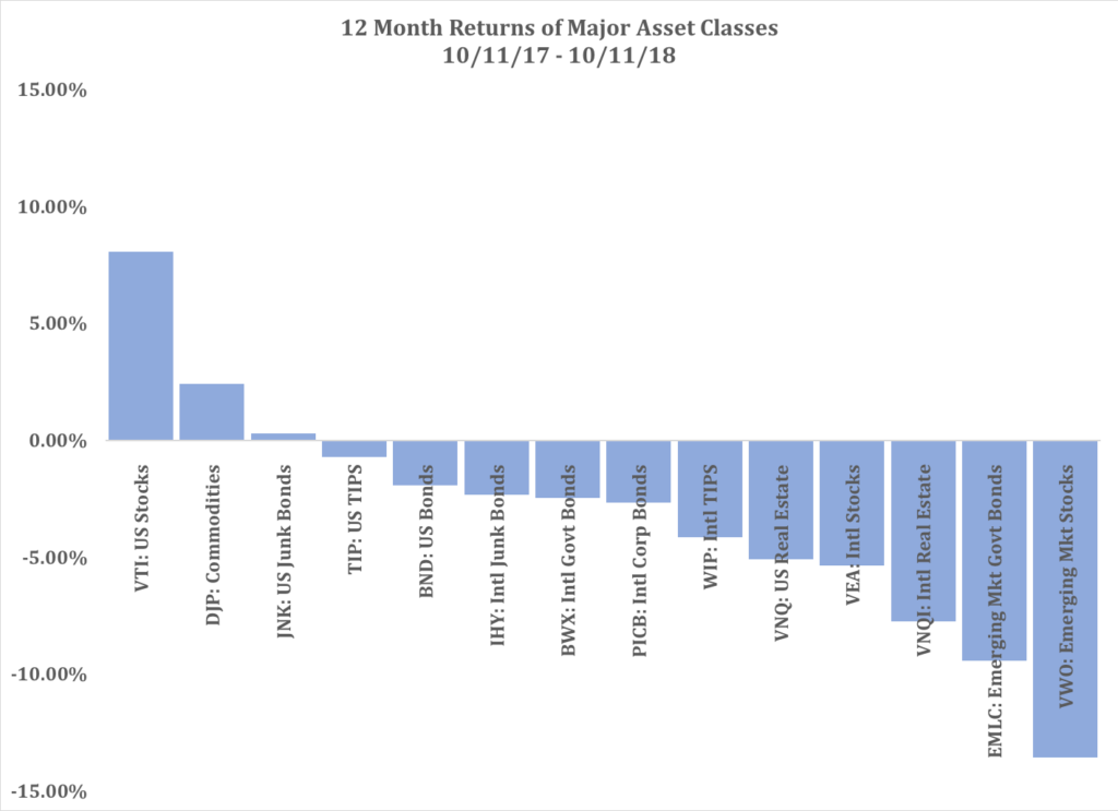
Back to the data. Though US markets have indeed done well over the last 12 months, the rest of the world has not:
Source 1: StockCharts.com
Outside of the US, over the last 12 months, almost every other major investment class is down. (The other exception is commodities: after being negative 6 of the last 7 years, they have eked out a slight gain this year, mostly due to the recent rise of oil.)
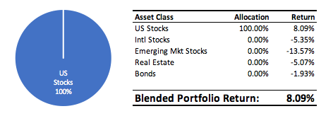
So, had I had the foresight 12 months ago to concentrate 100% of my assets in the US stock market (somehow knowing which assets to avoid), my portfolio returns at this point would look good:
But, had I instead thought that emerging stock markets were a better investment (after all, they were up 21% when I would have had to make that decision 12 months ago) and concentrated my assets 100% in emerging markets, my returns would not be as rosy:
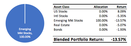
Ouch.
Hindsight is always 20/20; looking backward makes it clear the US was a better investment over the last 12 months. But we didn’t know that 12 months ago, just like we don’t know what the next 12 months will look like. One asset class will fare best, one will fare worst, and everything else will be somewhere in between.
Which brings me back to diversification. Diversification is nothing more than grandma’s sage advice to not put all your eggs in one basket.
So, instead of concentrating 100% of my assets in one single market or another 12 months ago, let’s suppose I chose to diversify my assets across different investment types (stocks, bonds, real estate) and geographies (US, international, emerging markets):
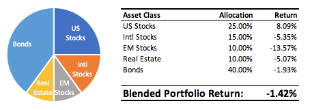
When compared to the US over the last 12 months, the diversified portfolio looks boring and weak. When compared to the emerging markets, the diversified portfolio looks like it’s doing the job it was designed to do: dampen the inevitable downside.
But there’s more to it than that. This scenario above looks at only the last 12 months, an extremely short window. What if we expand our analysis to the last 20 years? What happens when we diversify across different time periods and different parts of regular economic cycles?
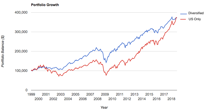
Source 2: Portfolio Vizualizer
As you can see, though rather boring to watch, the diversified portfolio can hold it’s own just fine. It returned 98% of what the US market did over this time frame (the US just recently caught up to our boring, diversified portfolio), at about half of the volatility. Which portfolio would you prefer to be in over the coming economic cycles?
In a diversified portfolio, highs will never be nearly as high as a concentrated portfolio (think the last 12 months vs. a US only portfolio), but lows will also never be as low (think 2000/2001, or 2008/2009). This is a classic case of the hare and the tortoise.
One last example from our friends at JP Morgan:
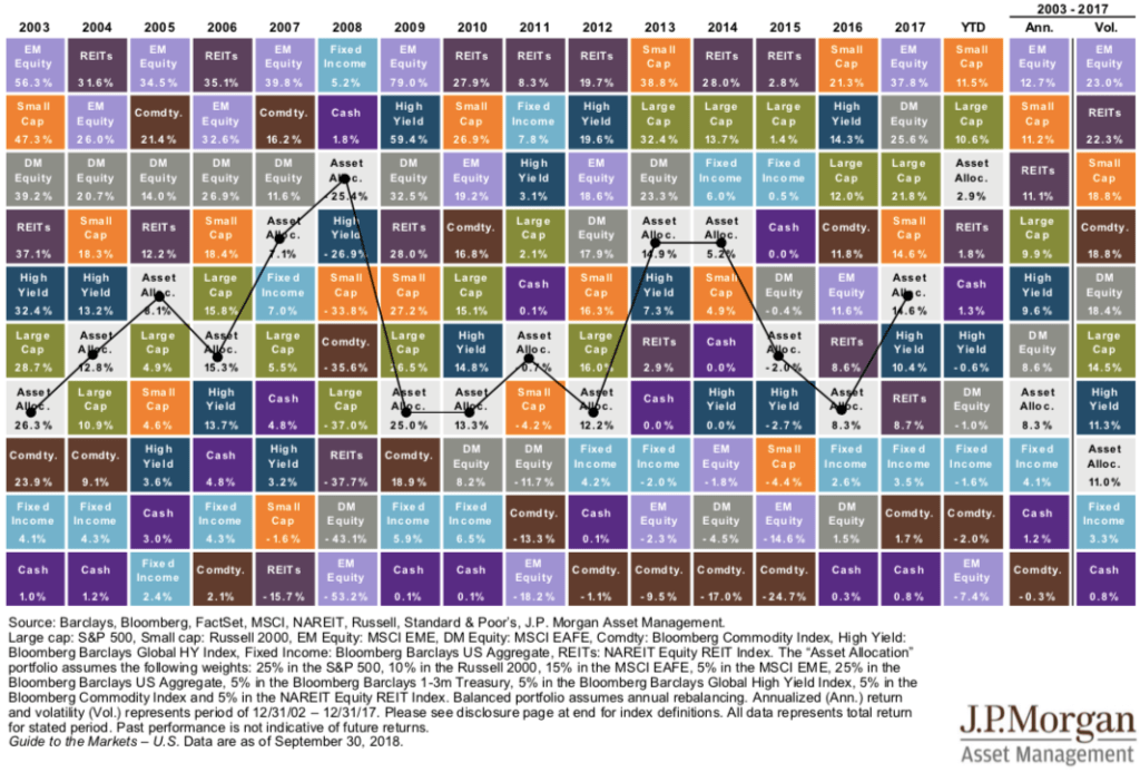
Each colored box represents a specific asset class: green is large US stocks, brown is commodities, gray is international stocks, and so on. Follow the years along the top and you can see that year-by-year, different asset classes behave differently. However, a blended portfolio of all the asset classes (the light gray Asset Allocation box) takes the middle road – achieving decent returns while dampening downside volatility (follow EM Equity if you want a real rollercoaster ride).
Diversification may never make us a killing; but it will likely never get us killed, either.

